Quarto Dashboards—a friendlier approach for beginners?
Our group often collaborates with researchers to create dashboards in Shiny. One of the most difficult parts of this is that Shiny is often brand new to the researchers we work with. Even with advanced R experience, learning Shiny is unlike learning any other R package because of the need to understand things like reactivity and the difference between UI and server, not to mention all the dang nested parentheses! So, we were excited by the announcement of dashboards coming to Quarto in version 1.4, but also unsure if this was just swapping one complicated framework for a different one? Would learners have an easier time with Quarto dashboards, or would this just mean they have to learn some Shiny and some Quarto in addition to R?
I created a rather unscientific survey to get an idea of how people feel about Quarto Dashboards by asking them to compare a simple dashboard made either with Shiny + bslib in app.R or a new Quarto Dashboard in app.Qmd. You can see the survey here (although it is closed to responses now).
The four questions we asked were as follows:
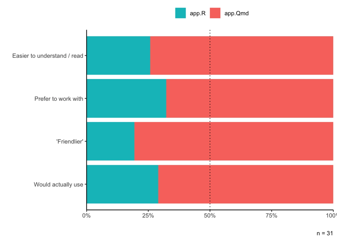
- Which is easier to understand/read?
- Let’s say you are tasked with modifying the dashboard to add a new tab with a few plots. Do you think this would be easier in app.R or app.Qmd?
- Which feels “friendlier” or more approachable overall?
- Which would you be more likely to use to create a dashboard?
Disclaimer
This is not an official survey of any kind and is subject to tons of biases. We only got 31 responses, which is a pretty small sample size to be making any strong conclusions. Please take everything in this blog post with a grain of salt!
Overall, people preferred Quarto Dashboards
Across all of the questions, more people chose app.Qmd over app.R showing that in our sample, people tended to prefer the new Quarto Dashboards over Shiny and bslib.
Folks were definitely excited about this upcoming feature in Quarto 1.4 and had a lot to say! It’s hard to whittle down the free responses to just a few for this blog post.
This is [mind-blown emoji] Since I spend most of my time building shiny apps and programming in R and have very limited experience with Rmarkdown or Quarto the syntax is alien to me. Despite this I agree that this is the fastest and easiest way to build a typical “dashboard” with simple UI and some visualisations.
Qmd clearly shows all the sections of the app but app.R obscures that with a lot of brackets.
In .Qmd, the text formatting is obvious and Markdown familiar. New tabs (appear) to follow Markdown headings. It’s natural to organize the code more clearly by breaking it into sections instead of a massive server + ui script. Quarto might be less amenable to highly customized formatting, though? (Just a guess.)
I am not an expert of shiny, and actually I feel a bit bullied by it, so try to avoid it when I can. I feel that the usual interface is really complicated (or perhaps I am dumb) and daunting. The Quarto interface, instead, looks more reasonable, as I find quite reassuring using the markdown coding.
I really like that Quarto’s Shiny support abstracts away some of the Shiny boilerplate (although it might slightly complicate more complex Shiny deployments).\n\nIn turn, I like that Quarto’s dashboard features focus on layout tools, as I feel like this dovetails well with Quarto’s Shiny support. Use Markdown and Quarto layout tools to build your UI structure, while targeted Shiny chunks insert reactive components. The result feels more readable than a heavily nested Shiny UI function to me (though I acknowledge it’s a change for Shiny veterans).
Some weren’t quite ready for Quarto Dashboards
There were 10 (out of 31) respondents who had different preferences depending on the question, with most of them saying they’d find it easier to work with app.R and would actually use app.R, despite finding app.Qmd easier to understand and “friendlier”.
Some of the explanations they gave:
The .qmd approach looks cleaner and easier. I would still use app.R for dashboards because they will likely be more customizable in Shiny. I’m not certain of this though.
Just because I’m more used to app.R and I don’t know what the support looks like so far for the Qmd format. But my answer would probably change in the future.
One thought I had is that the app.R document would be made more approachable if it had comments/headers like the Qmd one does. Though I realize that Qmd is more efficient because the headers for the reader also function as real functional headers in the dashboard too.
I’m more of a coder so the explicit code of the plain shiny is easier for me to understand out of the blue. The Quarto markdown has some implicit assumptions about how the markdown structure will be formatted in the final output that only made sense when I compared to the explicit code. If I’d read a quick primer on Quarto first I could have avoided the confusion.
I like the semantics of creating a document in Quarto vs rendering output in code in plain Shiny so I’d start anything new in Quarto and avoid all of the ()s and boilerplate code.
There were also two respondents who went the opposite way, saying they would actually use app.Qmd despite finding app.R easier to understand, easier to work with, and overall friendlier. Unfortunately these respondents did not comment as to why they made this choice.
And of course, there were some who had preferences for the classic app.R
I guess I’m more familiar with the syntax of shiny. I find the headings and style elements in quarto harder to understand. The logic of U.I and server is much clearer on the app.R
for me the two are quite the same in terms of how easy they are to understand. Shiny maybe looks more complex at start, but in Quarto I’d need some explanation or play around with the code to understand where to define new tabs.
Does experience determine preference?
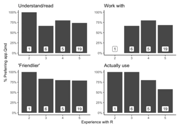
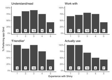
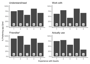
We also asked respondents to self-report how experienced they were with Shiny, Quarto, and R in general. The sample definitely skewed toward more advanced users. While there aren’t any strong trends, it does seem like preference for Quarto Dashboards drops off with the most experienced users. My interpretation is that advanced users view Quarto Dashboards as not being as flexible and customizable as something built using “pure code”. We can see that sentiment in some of the comments above.
Experience with R
Experience with Shiny
Experience with Quarto
Conclusion
This was certainly a fun “experiment” and we greatly appreciate everyone who took the time to take the survey, especially those who wrote such detailed comments! We will definitely be keeping this in mind for upcoming workshops on Quarto and Shiny and for the next dashboard we create.

