
Expanding existing knowledge of data viz in R
Summer series on ggplot2
How to get to the next level? This is a common refrain we at CCT Data Science hear from researchers, especially those new to coding. While a plethora of well-tested introductory material are available, including from the Carpentries and UA’s own Jeff Oliver, the path to becoming a proficient, confident scientific programmer is less obvious. We set out to create materials for a common topic, data visualization in R, that builds deeper knowledge of process and execution. This resulted in a three-part workshop series on “next level” ggplot2 skills and knowledge.
First up, Jessica Guo focused on the foundations of ggplot2, which took her all the way back to Hadley Wickham’s initial paper titled ‘A layered grammar of graphics’, published in 2010. Her teaching materials were organized by major concepts in the grammar of graphics, as well as practical examples of why different syntax can produce identical outcomes and similar syntax can produce unique plots. By understanding the system of layers and defaults, as well as consulting ggplot2’s thorough documentation, learners can more quickly approach making plots from scratch and troubleshooting errors that arise.
In part 2, Eric Scott focused on customizing data visualizations to meet the needs and demands of publication quality graphics. The goal here was to cover that final stretch from data to publication by learning how to tweak the appearance of plots including things like adding custom color scales, customizing axes, modifying themes, and saving high resolution images in multiple formats.
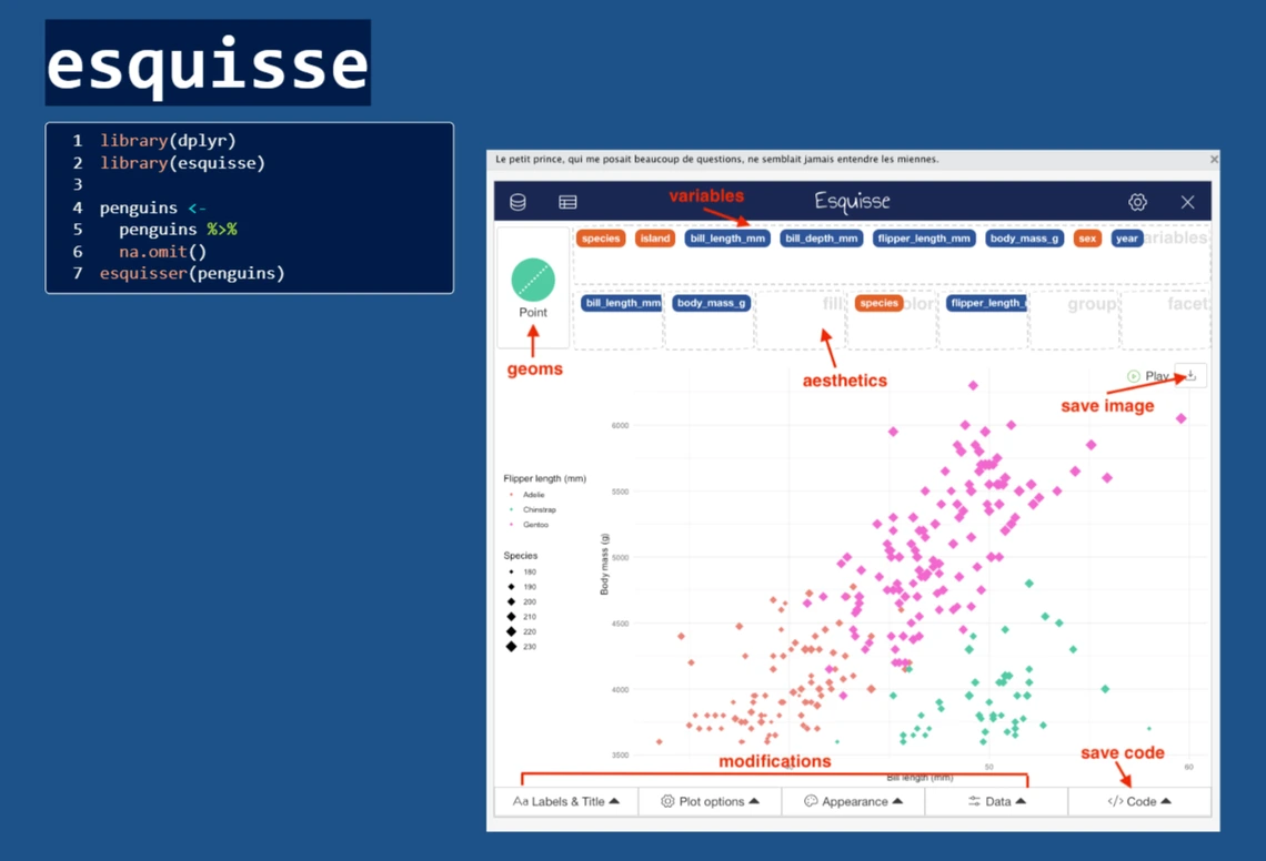
Finally, Eric and Kristina tackled the wide world of ggplot2 extensions in part 3. Participants were shown ways to discover the perfect extensions to the ggplot2 package for their needs. With more than 120 registered ggplot2 extensions, there was no way we could cover them all, but Eric and Kristina walked participants through examples from a few really useful ones: gganimate for producing animated plots, plotly for producing interactive plots, esquisse for a GUI to build ggplots, and ggrepel for direct labeling of data on plots.
We had 41 attendees total to the three workshops in the series, with multiple folks who attended two or all of the sessions. Feedback about these workshops was primarily positive, with a lot of emphasis on how much deeper everyone’s understanding of ggplot2 is now. We are excited to share the materials from these workshops, and keep helping everyone get to that next level!