
Green Stormwater Infrastructure Data and Dashboard
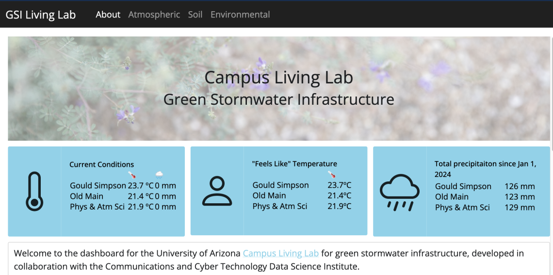
Landing page of https://viz.datascience.arizona.edu/gsi-dashboard/
Our latest data science incubator to wrap up is a collaboration with Dr. Vanessa Buzzard, a Senior Researcher in SNRE, and Malcolm Barrios, an undergraduate in the College of Engineering. Dr. Buzzard and Dr. Laura Meredith lead the Campus Living Lab initiative—an interdisciplinary project that aims to turn green stormwater infrastructure on campus into a “living lab”. To that end, a variety of environmental sensors have been placed at three locations around campus to collect data. You may have even seen them without realizing what they are!
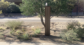
One of the three green storm water infrastructure sensor towers on campus
Malcolm Barrios
Our role in this project was to 1) set up an automated workflow to pull data from these sensors and integrate them into a cleaned dataset, 2) make these cleaned data citable and accessible to researchers upon request, and 3) to create an interactive dashboard to explore the data for use by researchers and educators. I’ll briefly discuss how each of these works.
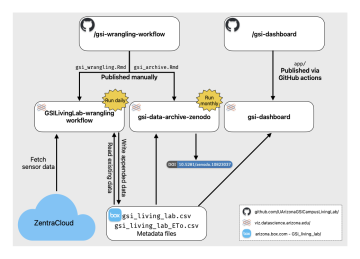
The automated data cleaning workflow starts by pulling data for each sensor from the sensor vendor’s data platform, ZentraCloud, using their R package zentracloud. These data are then combined and wrangled into a useful format and uploaded to a Box folder using the boxr R package. All of this is run daily using a scheduled R Markdown report on the University’s Posit Connect server.
To make data available to researchers and citable, the data and associated metadata stored on Box are archived with Zenodo monthly and given a versioned DOI. This is accomplished with another scheduled R Markdown document on Posit Connect that accesses the Zenodo API using the httr2 package. Zenodo conveniently provides a DOI that will always link to the most recent version of the data: 10.5281/zenodo.10823037.
Finally, the interactive dashboard was built with Shiny and is also hosted on the University’s Posit Connect server. In this dashboard, you can filter by date and site, and view hourly or daily atmospheric data, monthly summaries of soil data, and calculated metrics such as plant available water or heat index. While Dr. Buzzard and Malcolm Barrios contributed to all aspects of this incubator, this is probably where their input was most important. Malcolm prototyped all of the plots seen in the dashboard and took the lead on creating the landing page you first see when you visit the app.
We all learned a great deal in the course of this incubator—in particular, how to programmatically access Box and Zenodo, which make a powerful combination for storing regularly updated data and making it accessible to others.